In a world where even Android phones priced below Rs. 20,000 can do pretty much everything the average person might need, Apple’s Pro tier of iPhones, which all cost well over Rs. 1,00,000, have to push above and beyond. Each new model has to advance the state of the art, or has to at least seem fresh and fashionable. This is the route that Apple has taken for the iPhone 14 Pro and iPhone 14 Pro Max – they don’t do anything drastically new and they don’t look much different, but there are a few updates that might make you decide to upgrade if you haven’t felt the need to before now.
We’re reviewing the iPhone 14 Pro, but its larger sibling, the iPhone 14 Pro Max, offers identical functionality for those who want a bigger screen or better battery life. In my review of the iPhone 13 Pro Max, I found it a bit too heavy and unwieldy for everyday use, and that hasn’t changed with this generation. After spending a bit of time with both at Apple’s big launch event, it was time to decide, and I think the iPhone 14 Pro offers the right balance for me. Read on for my full review.
iPhone 14 Pro price in India
Unfortunately, Apple has raised prices in India even though both these phones cost the same as their predecessors in the US. Both models are available with 128GB, 256GB, 512GB or 1TB of storage. The iPhone 14 Pro in each of these capacities costs Rs. 1,29,900, Rs. 1,39,900, Rs. 1,59,900 and Rs. 1,79,900. The iPhone 14 Pro Max costs Rs. 10,000 more for each, so the equivalent variants are priced at Rs. 1,39,900, Rs. 1,49,900, Rs. 1,69,900 and Rs. 1,89,900 respectively.
You still don’t get a charger or headset in the box; only a Lightning cable and a SIM eject pin. You’ll need to spend more if you want a 20W or higher USB Type-C adapter since even if you got one with an older iPhone, it won’t be quite as fast.
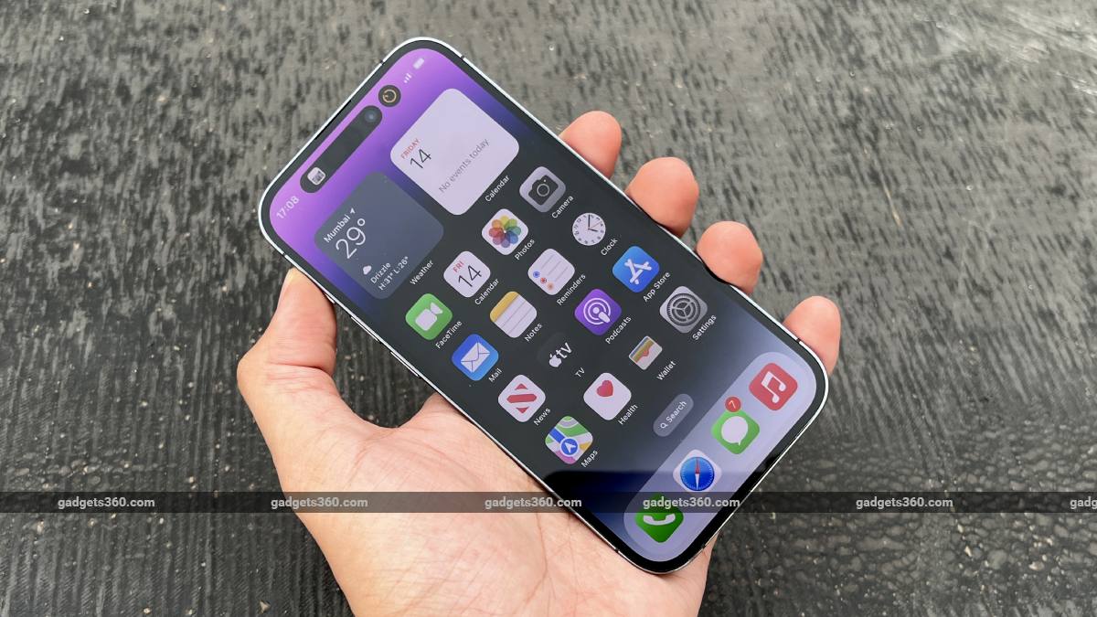
The Gold and Silver colour options are the same as before, but Graphite has been replaced with a darker Space Black option. The signature colour for this launch is Deep Purple, and this is what I have with me. Apple has released an additional colour option mid-cycle for the past two generations, so we might see something fresh around March next year if that continues to happen.
The Deep Purple colour is unlike anything Apple has released before, and looks different indoors and under sunlight
iPhone 14 Pro design
Of course the big news is the Dynamic Island, which, as Apple says, was developed as a combination of hardware and software capabilities to make the best use of the fairly massive camera hole. It also gives Apple something unique to market – while the Android world has been quick to try replicating it, it’s obvious that no other company had even thought about doing something along these lines before, and they might not achieve the same level of integration. We’ll talk more about this in a minute.
As for overall design, nothing much has changed for the past few years. Apple’s MagSafe accessory ecosystem requires a flat back, and we also still have a flat stainless steel band with rounded corners running around all four sides. The iPhone 14 Pro isn’t the easiest phone to hold, and the larger iPhone 14 Pro Max is even more awkward without a case. The two weigh 206g and 240g respectively. If you look closely, you’ll notice that the borders around the screen are slightly narrower than on previous models.
The Deep Purple unit that I have looks quite sober indoors – you might not even realise it isn’t grey. However, when the panel catches the light, you can see a rich plum colour with an almost metallic tone. The stainless steel band and the metal rings around the three cameras match the colour of the rear panel but are very susceptible to smudges. The raised camera island is made of clear glass, and if you aren’t using a case its edge can feel uncomfortable.
Apple continues to use its trademarked Ceramic Shield material for the display, and toughened glass on the back. All current-gen iPhones are IP68 rated for water and dust resistance. Units sold in the US do not have a physical SIM tray – Apple wants to transition to eSIMs only – but thankfully the ones sold in India still work with one Nano-SIM and one eSIM. There’s still a Lightning port on the bottom – ff you were hoping for a switch to USB Type-C, you might have to wait another year.
![]()
The iPhone 14 Pro’s stainless steel frame picks up smudges easily
iPhone 14 Pro Dynamic Island and always-on display
The biggest change to the iPhone 14 Pro siblings is their displays. The good news is that Apple has finally dispensed with the notch, which although instantly recognisable, has become a bit old-fashioned. The bad news is that the Dynamic Island, which takes its place, isn’t a huge improvement. In promotional videos, it looks superbly slick – and it is, visually at least. That’s because of Apple’s tight control over hardware and software, allowing it to do things like optimise animations with anti-aliasing, and make the homescreen seem to “flow” around it. The concept is also incredibly imaginative and feels fresh, in a world where so many phones are physically indistinguishable.
The idea of using the blank space between camera holes, and in fact expanding it rather than trying to make it blend in, took the entire audience at Apple’s launch event by surprise. Supply chain leaks gave us an idea of the hardware, and if you look at the front of the iPhone 14 Pro under strong light, you’ll see the borders of the pill-and-hole cutouts that we expected. It’s software that allows Apple to use space around and below these gaps, arranging information and icons so that it all still looks cohesive. You can even tap over the actual camera hardware – there are no dead zones for touch detection. This could lead to smudges over the lens, though.
What Apple has done, essentially, is lean on the fairly old concept of a second screen. LG Models such as the X screen (Review) and V20 (Review) from 2016 experimented with an extended screen area filling the lateral gap next to the front camera, used for background information and controls. What was missing back then was wider OS-level integration, and it will be interesting to see how Apple encourages developers to work with the Dynamic Island and what they come up with.
![]()
Up to two apps can show status information and you can tap either island to jump back into its app
There’s usually space for two small icons or text labels on either side of the front camera and Face ID hardware, and everything is enclosed in a single black oval. Long-pressing this can expand the “island” to show more context or controls. For example, if you’re playing music, you’ll see a small album art icon and an animated waveform, but tapping the island will bring up a full set of controls along with a progress bar, bigger thumbnail and artist/album information. Some indicators are simpler – a padlock when the screen is locked, a bright green icon when you’re tethering, and a bell plus text label when activating or deactivating silent mode, amongst others. You can also have a second app showing its status as a single icon in a secondary “island” to the right.
The ”island” itself is however very large and awkward, even when completely blank. Much like the notch, it requires that content and controls in most apps start below it, so it often feels as though there’s a thick band at the top of the screen doing nothing but occupying space. It took some getting used to the visual distraction of the island when using some apps, and yes, video as well as some games display all around it when stretched to full screen (though without any status icons).
In terms of utility, there were times during my review period when I really liked the dynamic island, but also times when I wished it could be turned off. It’s nice to be able to quickly change music tracks when scrolling through Reddit, for example, but on the other hand the animated waveform was constantly distracting and a skip button there would be more useful.
![]()
You can clearly see the hardware within the large “island”, which is what early rumours were based on
It’s easy to imagine the Dynamic Island in secondary screen use cases, like keeping an eye on real-time sports scores or situational updates while you’re doing something. I quite liked seeing a progress indicator ring when copying huge files over AirDrop. Conversely, I really didn’t need a huge, bright green tethering icon in my face all the time. Other system animations, such as when registering for Face ID recognition or connecting AirPods, don’t really need the island but just use it for design. More types of notifications could have been integrated here. In fact, the design could easily be adapted to work around and below the notches on the iPhone 14, iPhone 14 Plus, and even older models, though it might not be as visually slick.
The other big exclusive feature is the always-on display mode. This is something the Android world has enjoyed for years (and even Symbian phones had more than a decade ago) – but of course Apple has done it differently. The company apparently waited for its SoC, display, and software to all be good enough, and you shouldn’t see too much of an impact in terms of battery life.
Instead of going off, your display now dims, but your lockscreen widgets and wallpaper stay put. Apple’s ability to tweak contrast and brightness mean that information and even details in your wallpaper image are still visible. The refresh rate drops, so some widgets and active notifications don’t refresh constantly. Apps might even be able to stay partially active when the phone is locked. The always-on display will turn itself off if the phone is still for a while or placed in a pocket, and of course when low power mode is active.
I found the always-on display to be a bit disconcerting, and given the fact that all modern iPhones unlock themselves automatically when your face is in the frame, even inadvertent taps on the screen can result in unintended interactions. It feels as though the screen is actually on. There’s also the matter of iOS 16 automatically collapsing notifications into a pile, so you don’t have as much information at a glance as you do on some Android-based implementations. Icons for apps that have generated notifications would have been useful. Overall, the always-on display was nice to have when the iPhone 14 Pro was lying on a table or couch as I worked, but it will take some time to get used to.
![]()
The always-on display (right) is the lockscreen itself (left), just optimised to consume much less power
iPhone 14 Pro specifications and software
In Apple’s world, specifications are less important than the overall user experience, but we still like to know what’s going on inside our devices. The new A16 Bionic SoC is exclusive to this year’s Pro iPhones, so there’s a bigger performance gap than ever. This comes to the fore with photo and video processing, graphics, and power efficiency. Apple says this SoC uses 16 billion transistors and is manufactured on an industry-leading 4nm process. For years now, Apple’s in-house silicon has been able to outperform competition from Qualcomm and MediaTek, and the company is claiming a 40 percent speed bump over today’s leading competitors.
The A16 Bionic has two performance cores and four efficiency cores, plus a five-core integrated GPU and a 16-core “Neural Engine” for on-device AI and machine learning acceleration. There are also dedicated blocks for image processing (now branded “Photonic Engine”), display handling, and various other subsystems.
The iPhone 14 and iPhone 14 Pro both have 6GB of RAM across all variants, which Apple for some reason doesn’t disclose publicly. Battery capacities are also not specified, but third-party teardowns tell us that the two models have 3,200mAh and 4,323mAh units respectively. Battey life is described only in terms of time – up to 28 hours and 29 hours of local video playback with the two models respectively.
Charging speed is also not specified but has been pegged at 27W which is far below current norms in the Android world – maybe a switch from Lightning to USB Type-C, widely expected next year, will finally allow Apple to raise this. Also, speaking of Lightning, you’re still stuck with USB 2.0 speed for wired data transfers, which is a real shame when you might have up to 1TB of photos and videos to transfer. Wireless charging works at up to 15W with certified MagSafe accessories and there’s no reverse wireless charging.
![]()
While units sold in India do still have a Nano-SIM tray, that might go away in the future
The 6.1-inch Super Retina XDR display uses an LTPO OLED panel, and has a resolution of 1179×2556 pixels. The refresh rate can go from 1Hz to 120Hz. HDR peak brightness now goes up to 1600nits and the display can briefly hit 2000nits outdoors if needed. You get support for the Dolby Vision, HDR10, and HLG HDR standards as well as Dolby Atmos sound.
Other little hardware improvements include a move to dual-band GPS for better accuracy, much more sensitive accelerometer and gyroscope for crash detection, and the inclusion of satellite connectivity hardware to enable Apple’s new Emergency SOS capability (which isn’t available in India yet).
Apple ships the iPhone 14 series with iOS 16, and a few minor updates received during the course of this review have brought us up to version 16.0.3. The big new software features, many of which are available on older models, include lockscreen widgets and personalisation, AI tweaks such as automatic image cutouts and text recognition in videos, a Fitness app that works even without an Apple Watch, and assorted tweaks across many of the default apps. In India, users can now interact with Siri in mixed languages. More features such as iCloud Shared Photo Library and Live Activities will roll out later this year.
iOS has gained quite a few capabilities of late and is beginning to feel a bit disjointed. For example, adding lockscreen widgets isn’t entirely intuitive. If you want to show the world time widget, for example, it doesn’t choose cities that you’ve already added within the clock app, and it takes a while to figure out that you need to tap it while the widget selection panel is open to bring up a separate list of cities that you can edit. It also won’t automatically show your home city when you’re traveling elsewhere. You can also now have multiple lockscreens with their own wallpapers and sets of widgets, each linked to a different Focus mode state. However, if you just want to change Focus but keep the same widgets, you’ll have to manually set up the same arrangement for each lockscreen.
![]()
The iPhone 14 Pro has a bright, crisp HDR-capable 120Hz display
iPhone 14 Pro performance and usability
Unsurprisingly, with its 120Hz display, the iPhone 14 Pro feels buttery smooth. Animations are slick, iOS 16 is responsive, and you won’t have any problem getting things done. There are loads of preinstalled apps – several of which you might not ever use, but nearly all are removable. In day-to-day use, the only disappointment was relatively slow charging. I also noticed the iPhone 14 Pro getting a bit warm when plugged in to charge (using an official Apple 30W USB Type-C adapter) on occasion.
There’s nothing life-changing about the iPhone 14 Pro. It’s largely an iterative update, with the added novelties of the Dynamic Island and always-on display. That said, it’s familiar, comfortable, and easy to use.
Gaming won’t be a problem. I played Call of Duty: Mobile and Asphalt 9: Legends for a while with zero trouble. I also spent some time catching up on less demanding games such as Alto’s Odyssey and Fieldrunners 2 (which unfortunately showed that older titles need to be optimised for the screen resolution, rounded corners, and Dynamic Island). If you’re seriously into gaming, you might prefer the iPhone 14 Pro Max for its bigger screen and battery.
The new 3DMark Wild Life Extreme test, which renders at 4K, managed a total of 3,381 points with a frame rate of 20.2fps, and the standard Wild Life test maxed out with a frame rate of 59.3fps on the iPhone 14 Pro. For reference, an iPhone 13 Pro updated to iOS 16 managed 18.7fps and 54.4fps in the same two tests respectively. I also ran the Wild Life Extreme Stress Test, which loops for 20 minutes. This made the entire back of the phone almost uncomfortably hot, but showed that thermal throttling isn’t a huge problem as the lowest loop score was 2,051; roughly 60 percent of the best run. The iPhone 14 Pro also maxed out all of GFXBench’s test scenes, including the most demanding Aztec Ruins (High Tier) one.
![]()
The A16 Bionic SoC is exclusive to the iPhone 14 Pro and iPhone 14 Pro Max
Geekbench 5’s single-core and multi-core CPU scores were 1,884 and 5,305 respectively, compared to 1,739 and 4,862 respectively for an iPhone 13 Pro. The browser-based Basemark Web 3.0 test managed 1,295.82 points, and Jetstream 2.0 turned in a score of 266.893, as opposed to 1,172.84 and 188.152 for last year’s model.
Video in streaming apps looked bright and crisp. The Dynamic Island is immensely distracting if you want to fill the screen, but most 16:9 videos won’t overlap it. Apple also continues to deliver good stereo speakers that make video immersive and dialogue clear.
Battery life was decent for a flagship-class phone. I managed to get through a full day with quite a bit of camera use, including video recording, plus gaming. I ended my day with about 20 percent left. I didn’t notice much of a difference with the always-on display disabled, but that could be because it goes off after a while and isn’t active when the phone is in a pocket. Our HD video loop test ran for a respectable 19 hours, 41 minutes.
Charging, as mentioned, is nowhere near as quick as what many Android phones offer these days. I got to 29 percent in 15 minutes and was still at 86 percent after an hour. Apple claims you can get a 50 percent charge in 30 minutes, which is about right. It’s still a bit galling that you don’t get a fast charger in the box with such an expensive phone.
![]()
The iPhone 14 Pro is relatively easy to handle but many will prefer its larger sibling
iPhone 14 Pro cameras
There’s a big change with this year’s Pro iPhones, but once again, this is something we’ve seen in the Android world for years now. Instead of a 12-megapixel primary camera sensor, you now get a 48-megapixel sensor, but with clusters of four pixels acting as one. This improves the surface area of each pixel, allowing more light to be collected which results in better overall quality at low shutter speeds. In typical Apple fashion, the user doesn’t get a choice – this is just the default way to take photos. It’s only if you switch to ProRAW mode that you can choose to capture 48-megapixel shots, but this is clearly not aimed at casual users.
This also allows Apple to capture 12-megapixel shots using only the centre of the sensor area, which effectively gives you 2X optical magnification. This 2X zoom mode is a midway point between standard shots taken with the primary camera and 3X shots taken with the telephoto camera. For video, being able to capture frames with a considerable buffer on all four sides allows for a whole new level of video stabilisation, theoretically equal to using a gimbal to compensate for hand shake, bumps, and uneven motion. Action Mode joins last year’s Cinematic Mode, but for some reason it’s implemented as a toggle button, not a separate mode that you can select from the carousel – and it isn’t always obvious when it’s active.
The 48-megapixel primary camera and 12-megapixel ultra-wide camera actually have poorer apertures than their equivalents on the iPhone 13 Pro, although the sensor quality, software, and A16 Bionic “Photonic Engine” should deliver improvements overall. There’s enough power now to run enhancement operations on uncompressed sensor data much earlier in the processing pipeline. Low-light shots are said to be another big area of improvement for the iPhone 14 Pro and Pro Max – 2-3X depending on which camera is used – which means specs don’t tell the whole story. Another evolution is autofocus for the front camera for more sharpness even with creative composition.
iPhone 14 Pro daytime camera samples (top-bottom): Ultra-wide, 1X, 2X, 3X (tap to see full size)
In real-world terms, photos taken with the iPhone 14 Pro in daylight came out looking excellent. Colours are natural without being overblown. 48-megapixel shots are huge in terms of file size but if you use Lightroom or any other post-processing tool, you’ll unlock a lot more detail and nuance. Close-ups are very finely detailed, but Apple still switches to macro mode automatically which can mess with attempts to frame a close-up subject. This can be disabled in the iOS Settings app. Macros are a little grainy but very usable.
Tricky exposures in the daytime were handled well, and you won’t be disappointed with any of the cameras. Ultra-wide shots preserved quite a lot of detail even in distant objects, and weren’t bad in terms of exposure, colour, or distortion at the edges. Using the 2X zoom level gives you an effective 48mm focal length so it can come in handy for portraits, and detail is impressive when it comes to things like the texture of animal fur. Depth of field is great with the primary and telephoto cameras. For objects at a distance, 3X will nearly always make more sense than 2X, but it’s nice to have the option.
Low-light shots are captured quickly and scenes are crisp, with excellent detail and vibrant colours. The telephoto camera’s 3X optical shots are a little weaker than the primary camera’s 2X cropped shots in terms of low-light detail and definition, but you do still get very usable shots and quite a lot of flexibility when it comes to framing and composition. The primary camera at 1X is excellent at night, taking detailed shots with remarkably good dynamic range, with very little lag and almost no motion blur.
iPhone 14 Pro low-light camera samples (top-bottom): Ultra-wide, 1X, 2X, 3X (tap to see full size)
Cinematic Mode is unchanged, except for a new option to shoot at 4K HDR at 30fps or 24fps. Action Mode is the main new video feature. It works on all cameras but with varying degrees of effectiveness. This seems far more likely to be useful to most people than Cinematic Mode, but it isn’t exactly new or pathbreaking for smartphones.
Standard video shot with all three cameras was also great, in the daytime and at night – the telephoto camera is of course the shakiest when walking and recording. Colours look natural and motion is smooth at 1080p as well as 4K.
Selfies had great detail and good depth of field. Exposures are weighted heavily towards your face rather than the background. Portrait effects are the same as with previous iPhones, using the 3D depth sensing hardware.
iPhone 14 Pro camera samples (top-bottom): Daytime selfie, low-light selfie, macro (tap to see full size)
Verdict
The iPhone 14 Pro is a solid iterative improvement over its predecessor. In the US, there hasn’t been any price increase, which makes sense. Unfortunately, we aren’t so lucky in India. What was already a luxury is now even harder to justify. If you’re looking for the best iPhone in terms of features, camera quality and overall performance, you’ll buy this phone (or its larger sibling) regardless of price, but for a lot of people, it’s simply too far out of reach. Many Android phones today (and even older iPhones) offer all the functionality that most people want, for much less money, though maybe not with quite the same level of polish.
The Dynamic Island is something you might want to show off, or at least play around with. For me, the novelty wore off soon enough and I found it less useful than I had hoped it would be, but I’ll see how I feel as Apple and app developers come up with new ways to use it. Crash detection and satellite-based emergency messaging aren’t relevant in India yet. A lot of the smaller quality-of-life improvements do add up though; I’m tempted by the low-light photo quality bumps across all cameras, and to a smaller degree, the always-on display.
For anyone with an iPhone X (Review) or older, it might be time to consider an upgrade, and the iPhone 14 series offers quite a lot. However, the iPhone 13 Pro is still available for now, and costs a fair bit less at each storage tier, especially with festive sales on. You wouldn’t really be missing out on much by choosing that instead. It’s also now more than likely that USB Type-C and fast charging will be coming with next year’s model, and you can’t be blamed for wanting to wait for that.


